
Draft 1.
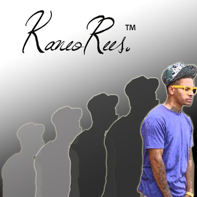
This is our first attempt at a digipak/album cover. We started by cutting out a picture of our artist 'Kaneo' from the background of the original picture on Photoshop. We used a sketch filter to create the pencil effect on him. Next, we added a shadow behind him, and used a 'glow' to the edges of the outline of his body. We then duplicated the shadow, so that it staggers behind the original cut, decreasing in size and shade/darkness of colour. The style in which the picture starts small and light and increases gradually is to represent his climb to fame. The small light shaddow represents how he saw himself before, small and insignificant, and the large coloured one shows his new found importance and his climb to stardom - very much 'the bigger picture'. We used the gradient tool to add a simple background, of black to white. We then chose a font from the website 'DaFont', which as you can see is fluent and looks professional. Then we finally added a 'TM' symbol, as the album name is 'Trademark' as we thought this was a clever way to portray the album name.
In the end we decided the background for this draft was too plain and simple, therefore thought we'd try and adapt this. See Draft 2 for further modifications.
No comments:
Post a Comment