#header-inner {background-position: center !important; width: 100% !important;}
Showing posts with label Digipak Research. Show all posts

Friday, 4 February 2011

Digipak Final

Here is our final draft of our artist's album covers - front and back.

Front.
We made our front cover by screen grabbing a shot from our music video. We then used a variation of effects and colour correction to reinforce the idea of an urban style 
surrounding. We also changed the brightness and contrast of the image, so that the illuminations created a counterbalance, to the darkness of the cityscape. We wanted to create a 'city glow' effect and we managed to achieve this by turning up the saturation.


Back.
Again, we took a screen grab from our video, and edited it so it had a direct correlation with the front. we used filters such as film grain to create a more visually alluring effect. 


Magazine Advert.
We used the same image from the cd cover to construct the magazine advert. This was so the audience could make a connection between the two, and find the album form the advert easily.  
we added a bit to the top using the same filter, as well as creating a flash light effect to emphasize the entire point of the piece - to advertise the release of the album.

Inside Cd Inlay.


Thursday, 25 November 2010

possible album back cover.


This album cover that I have created using an image found on google inserting the same layers as in the other draft that has been made. although we cannot use the image above, we may choose to recreate it to get the same effect. We used 'The Pretty Reckless' - Light Me Up's album cover as inspiration. This is because both covers use shocking images that are meant to provoke outrage.


51s1YTAzZWL.jpg

Digipak amendments.

Because it is not possible to use a non-original image as part of our work, we can't use the album back cover that we have mentioned in the post below. We intend to recreate it, to the best of our ability due to the fact that we believe that it is perfect for the artist and the message we are trying to portray.

Tuesday, 16 November 2010

1st draft of the back cover


This is the first effort of our back cover which has the tracklist on it featuring all the songs on the cd inside. It also has the hyperlink to the artist's facebook channel on it; this is due to the fact that he is an artist that uses viral methods to his advantage a large portion of the time. It also has the parental advisory label on it, his music has swearing and features mainly adult themes throughout.

Tuesday, 19 October 2010

Digipak Draft 4.


Draft 4.

This is our final draft, and i think we've definately got it perfect. We found a font again from the site 'DaFont', and changed it completely so that it fits with the new background, and its more graffiti and urban, than the last one. We feel that writing the word 'Trademark' is more clear to the buyers that that's the name of the album, rather that just the letters 'TM'. Overall we feel our final album cover really reflects and represents our artists image.

Digipak Draft 3.


Draft 3. 

We changed the background to a more urban style theme, to try and portray the style and genre of music of our artist to a fuller extent.

Digipak Draft 2.


Draft 2.

Here you can see the modifcations we made to draft 1. We changed the background, and gave it a more marble effect. We think this looks a lot more professional, but we think it portrays our artist in the wrong way - style, music, image etc. it portrays more of a 'soul' image, and this contrasts the image we wanted for our artist. We also changed the colour of the font, so that it stood out more.

Digipak Drafts.

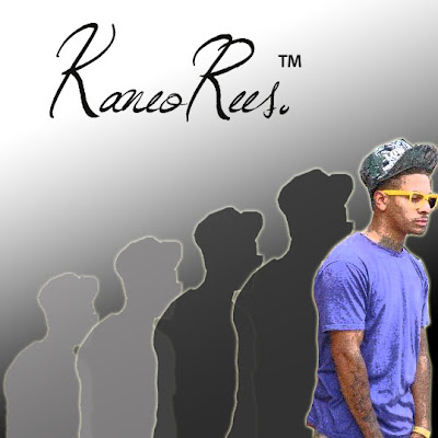
Draft 1.

This is our first attempt at a digipak/album cover. We started by cutting out a picture of our artist 'Kaneo' from the background of the original picture on Photoshop. We used a sketch filter to create the pencil effect on him. Next, we added a shadow behind him, and used a 'glow' to the edges of the outline of his body. We then duplicated the shadow, so that it staggers behind the original cut, decreasing in size and shade/darkness of colour. The style in which the picture starts small and light and increases gradually is to represent his climb to fame. The small light shaddow represents how he saw himself before, small and insignificant, and the large coloured one shows his new found importance and his climb to stardom - very much 'the bigger picture'. We used the gradient tool to add a simple background, of black to white. We then chose a font from the website 'DaFont', which as you can see is fluent and looks professional. Then we finally added a 'TM' symbol, as the album name is 'Trademark' as we thought this was a clever way to portray the album name.
 In the end we decided the background for this draft was too plain and simple, therefore thought we'd try and adapt this. See Draft 2 for further modifications.


Thursday, 30 September 2010

More album covers that inspire us.


These album covers inspire us due to their simplistic effect. We also like the use of basic colours which add to the overall tone of the pieces. We may use these techniques ourselves when creating our own digipak, advertising our artists.

Thursday, 23 September 2010

Existing Album Covers


These album covers are by artists that are similar in many respects to ours, these include: their genre, their style of deliverance, their image, and marketing. We could draw from these when producing our artist promo pack, which includes: an album cover, magazine advert and interior album artwork.