#header-inner {background-position: center !important; width: 100% !important;}
Showing posts with label Georgia Wilde. Show all posts

Thursday, 24 March 2011

Evaluation Question 4- Georgia Wilde

Question 4- How did you use new media technologies in the construction and research, planning and evaluation stages?

This year we had a brand new HD camera to use. This meant our work was better quality in picture, it took us less time to upload things onto the computer, it was lighter to carry and hold, and the audio quality was also better.
This year we had a better knowledge of the programmes we were using, such as FinalCutPro, SoundtrackPro, and Blogger. Therefore making it easier for us to edit and complete our blog.
We uploaded our work to Youtube and Facebook quicker and with greater ease than last year, when everything was newer, and slower and harder. 

Example of HD camera we used.

Evaluation Question 3- Georgia Wilde

Question 3-What have you learned from your audience feedback?


We posted our video on Facebook, and got some really positive feedback. Obviously the target audience for our video would be our age group, young people, but i think even the older generation could appreciate the hard technical work we hard put into our video.


Facebook feedback
We also posted our video on YouTube, and got 3 postitive comments back from there...

Positive feedback on YouTube

We also posted our video on a member of our group's younger sister's Facebook page. We did this to get some feedback from an even younger age group, the 'tween' generation.

Feedback from 'tweens'

As you can see it went down very well with this age group, they all seemed impressed with what we'd done and we were very pleased. Our artist Kaneo also got to watch our video for his song, and a member of our group spoke to him online and he seemed pleased with our efforts, as it had successfully promoted his song and made him look good too. 


Evaluation Question 2- Georgia Wilde

Question 2- How effective is the combination of your main product and ancillary texts?

I think they are very effective together, all of our album artwork and our magazine advert come from screenshots of our actual video. Therefore tying in the entire 'Kaneo' debut product. People would recognize our album cover from watching our music video and visa versa. 


Evaluation Question 1- Georgia Wilde

Question 1- In what ways does your media product use, develop or challenge the forms and conventions of real media texts?

We used the convention of black & white, to show the past, as in other existing music videos. Such as The Script's 'Breakeven' where they use colour for the past, and black & white for present. 


Colour to represent past

B&W to represent present


We developed the convention of using random shots throughout the video as such other videos do, in the end it turned out our 'random' shot related to the rest of the storyline and narrative, so they weren't that random after all...

This started out as a random image
For example, at first, we filmed a random shot of a clock ticking, to speed up, as we thought it would look cool and random, but in the end we used several throughout the video, to show that she was waiting for the boy as he was late. 

We challenged the convention of having the actual artist or performer in the video, as in the end it just turned out to be a story of a boy and girl in love, with Kaneo's song in the background. Some people think that a key convention of a music video is the artist, but some videos, including ours go against this idea. 

Video by 'Flobots- Handlebars'
For example, a band called 'Flobots' brought out a music video for their song 'Handlebars' where the entire video is in cartoon, and does not show the artists. The cartoon storyline relates to the lyrics of the song, it just does not show the artist, which we also chose to do.  


Tuesday, 15 February 2011

Evaluation

Q1-In what ways does your media product use, develop or challenge the forms and conventions of real media texts?

Theory and concepts related to the form and conventions of music video
· Stephen Hill article from the Media Magazine-‘How Video didn’t kill the Radio star’
· Andrew Goodwin’s features of the music video from ‘Dancing in the Distraction Factory’
· Post-modernism-the idea that everything is borrowed
· Intertextuality
· Genre-does this concept apply to music video anyway?!
· Pastiche
· Parody
· Industry conventions-any rules for a first video? Video as marketing device.
· Impact of the DIY aesthetic and ‘YouTube culture’ on the form
· Relevant print terms for the ancillary texts

Q2- How effective is the combination of your main product and ancillary texts?

· Textual analysis and deconstruction of your products to demonstrate their effectiveness-what you did to ensure an effective combination?
· Demonstrate you understand why this combination has to be effective-launching a promo package/new artist into the market/audience identification/representation of the artist to an audience

Q3-What have you learned from your audience feedback?

· Analyse responses in detail-what is the feedback from the target audience you identified in your research and planning?
· Are the responses different outside of the target audience?
· Does audience preference for a particular style of music affect their appreciation of your video?
· How significant is your audience feedback? Do you agree with the comments or not? Justify your answers
· Does the feedback reveal anything about differences in gender/age?
· What are the factors that make a great music video in audiences’ eyes?

Q4-How did you use new media technologies in the construction and research, planning and evaluation stages?

· No theory as such for this one but consider the key concepts for Section 1A of the exam e.g. creativity/technology/use of conventions from real media texts
· Describe what you used and the role it played in all stages-could you have been as creative without the technology?Were their conventions of the form that you couldn’t create because of the technology we are limited to in college?
· What things were made easier because of technology? Was anything more difficult?
· Summary of the ways in which technology is affecting your media practice

Friday, 4 February 2011

Digipak Final

Here is our final draft of our artist's album covers - front and back.

Front.
We made our front cover by screen grabbing a shot from our music video. We then used a variation of effects and colour correction to reinforce the idea of an urban style 
surrounding. We also changed the brightness and contrast of the image, so that the illuminations created a counterbalance, to the darkness of the cityscape. We wanted to create a 'city glow' effect and we managed to achieve this by turning up the saturation.


Back.
Again, we took a screen grab from our video, and edited it so it had a direct correlation with the front. we used filters such as film grain to create a more visually alluring effect. 


Magazine Advert.
We used the same image from the cd cover to construct the magazine advert. This was so the audience could make a connection between the two, and find the album form the advert easily.  
we added a bit to the top using the same filter, as well as creating a flash light effect to emphasize the entire point of the piece - to advertise the release of the album.

Inside Cd Inlay.


Tuesday, 25 January 2011

most recent rough cut

To Do List

  • shoot the rest of the piano shots
  • shoot the 'happy' black and white shots (wine & laughing)
  • shoot possible argument in past (B&W)
  • redo our digipak
  • do evaluation questions
  • edit rest of video

too much really! ahhhhh help us :(

Thursday, 13 January 2011

First Rough Cut


Here is a rough cut of our footage so far, we still have a long way to go. Adding performance footage and more narrative will help this...but we feel we have made lots of progress. We have changed our narravtive, so that anything in black and white is in the past, and anything in colour is the present. We are gonna show shots of Kaneo and the girl in happier times, laughing and drinking wine, then more shots of present, him turning up late and standing her up. Originally we wanted to be more abstract are arty, but we feel this is a better way to go. 
Also we changed the opening, so that the beginning is actually the end. So we'll use that opening shot at the end also. 

Tuesday, 7 December 2010

animatic


This was made to show that our ideas are starting to take shape, its not the finished article.

Tuesday, 30 November 2010

Work Update 29.11.10

At the moment we are trying to complete our animatic, its almost there, but the editing and cutting is so much harder than first expected! We have all the images ready to upload for our storyboard. Then once we've done all that, we will be ready to commence filming.

Thursday, 21 October 2010

Update

To save any confusion, the song we have chosen (Next) has recently been given a new name by the artist, 'I Can't Do This Anymore'. We presumed it was called 'Next' as on the mixtape it was named this, but we soon discovered the video on youtube for exactly the same song, with a different title.

Our Chosen Song.

New Ideas for Video.

The general outline is that we'll be cutting from the performance of the piano, to random and abstract images. We have also decided our video will be following a rough narrative, the story of a guy who is heartboken and needs to move on, but cant let the girl go. This means our video will now consist of three sections; The narrative, piano playing, and Abstract shots. These three sections will intercut with each other.
Here are a few of our initial ideas for shots and filming:


  • Shot of missed calls from him, on girls mobile.
  • Location idea- sea front at night time, lights, the sea washing in and out, promanade.
  • Shot out of window of the landscape at night, streetlights, town lit up, establishing.
  • Ideas for types of shots for piano- side, revolve around, from high above, music sheets, just fingers or hands, shots of singer.
  • Slow motion- walking down stairs.
  • Shot of a door shutting as if she's left him.
  • Water tap dropping (tears)
  • Board with dice rolling (reference to games)

Lyrics.

I don't, 
wanna talk it all out i'd rather just forget, 
you got alot to say but i'm not listening, 
please spare me the tears 
cos they have no effect
and everything we had instead
i should of seen it coming. 
(Yeah) You had me dived by these disguise and i couldn't see
the way you played your game with your tricks you had me deceived, 
but now im over it 
I'm so down to taking that step,
I'm leaving i guess i gotta move on to the next.


[Chorus]
Oh i, 
don't wanna stay in love and live with this regret, 
please, i gotta take this of my chest, 
baby i, cant give anymore
when there is nothing left, im leaving..
I guess i've have gotta move on to the next.

You know, 

you got alot of nerve saying that its my fault, 
we should of thought twice 
before we got involved, 
everything thing you do, 
you let it fall, 
baby you were the cause, 
you didn't care at all! 
Don't tell me that you gave me your best 
you know that aint true, 
be real babe you set us up to fail with all that you do
but now im over it, 
i'm so done now im taking that step im leaving
i guess i gotta move on to the next.

[Chorus]

Oh and i, 
don't wanna stay in love and live with this regret, 
please i gotta take this of my chest, 
baby i cant give anymore 
if there is nothing left, im leaving.. 
I guess i've gotta move on to the next.

Tuesday, 19 October 2010

Digipak Draft 4.


Draft 4.

This is our final draft, and i think we've definately got it perfect. We found a font again from the site 'DaFont', and changed it completely so that it fits with the new background, and its more graffiti and urban, than the last one. We feel that writing the word 'Trademark' is more clear to the buyers that that's the name of the album, rather that just the letters 'TM'. Overall we feel our final album cover really reflects and represents our artists image.

Digipak Draft 3.


Draft 3. 

We changed the background to a more urban style theme, to try and portray the style and genre of music of our artist to a fuller extent.

Digipak Draft 2.


Draft 2.

Here you can see the modifcations we made to draft 1. We changed the background, and gave it a more marble effect. We think this looks a lot more professional, but we think it portrays our artist in the wrong way - style, music, image etc. it portrays more of a 'soul' image, and this contrasts the image we wanted for our artist. We also changed the colour of the font, so that it stood out more.

Digipak Drafts.

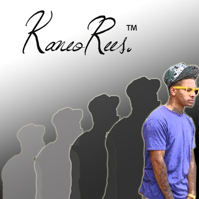
Draft 1.

This is our first attempt at a digipak/album cover. We started by cutting out a picture of our artist 'Kaneo' from the background of the original picture on Photoshop. We used a sketch filter to create the pencil effect on him. Next, we added a shadow behind him, and used a 'glow' to the edges of the outline of his body. We then duplicated the shadow, so that it staggers behind the original cut, decreasing in size and shade/darkness of colour. The style in which the picture starts small and light and increases gradually is to represent his climb to fame. The small light shaddow represents how he saw himself before, small and insignificant, and the large coloured one shows his new found importance and his climb to stardom - very much 'the bigger picture'. We used the gradient tool to add a simple background, of black to white. We then chose a font from the website 'DaFont', which as you can see is fluent and looks professional. Then we finally added a 'TM' symbol, as the album name is 'Trademark' as we thought this was a clever way to portray the album name.
 In the end we decided the background for this draft was too plain and simple, therefore thought we'd try and adapt this. See Draft 2 for further modifications.